Strongbow
Rebranding for a group of companies with investments in South-East Asia, Russia and Eastern Europe.
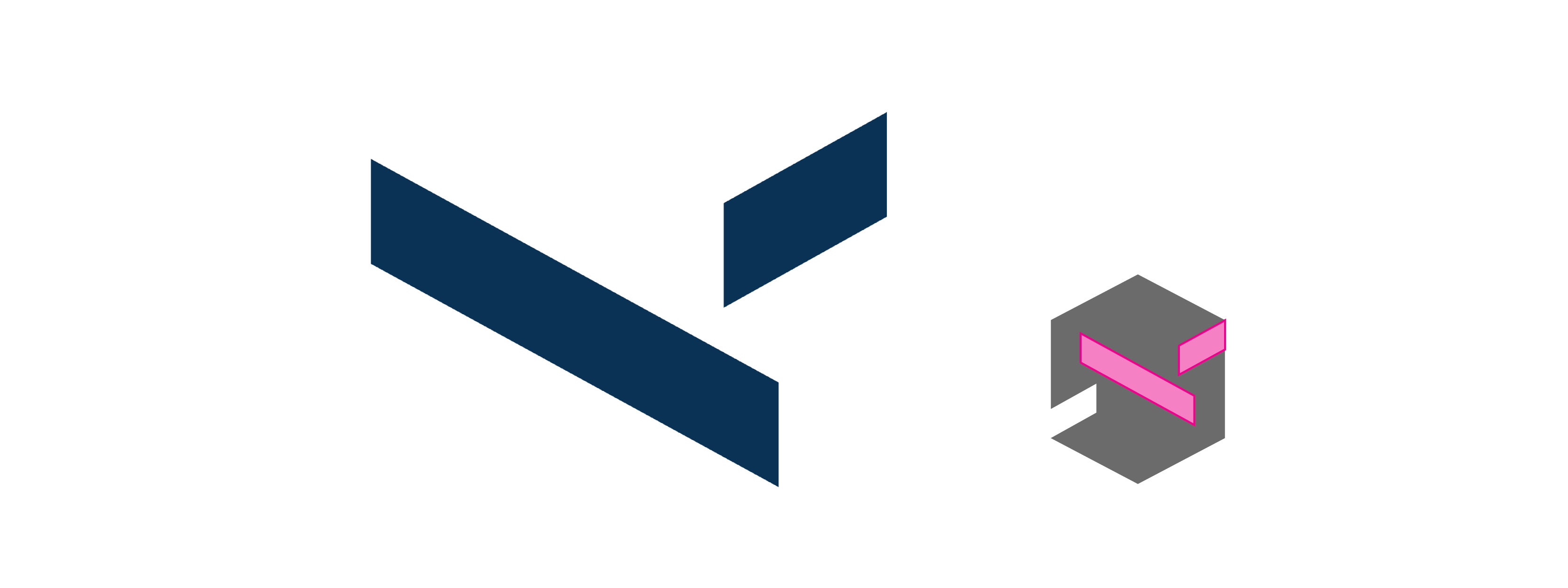
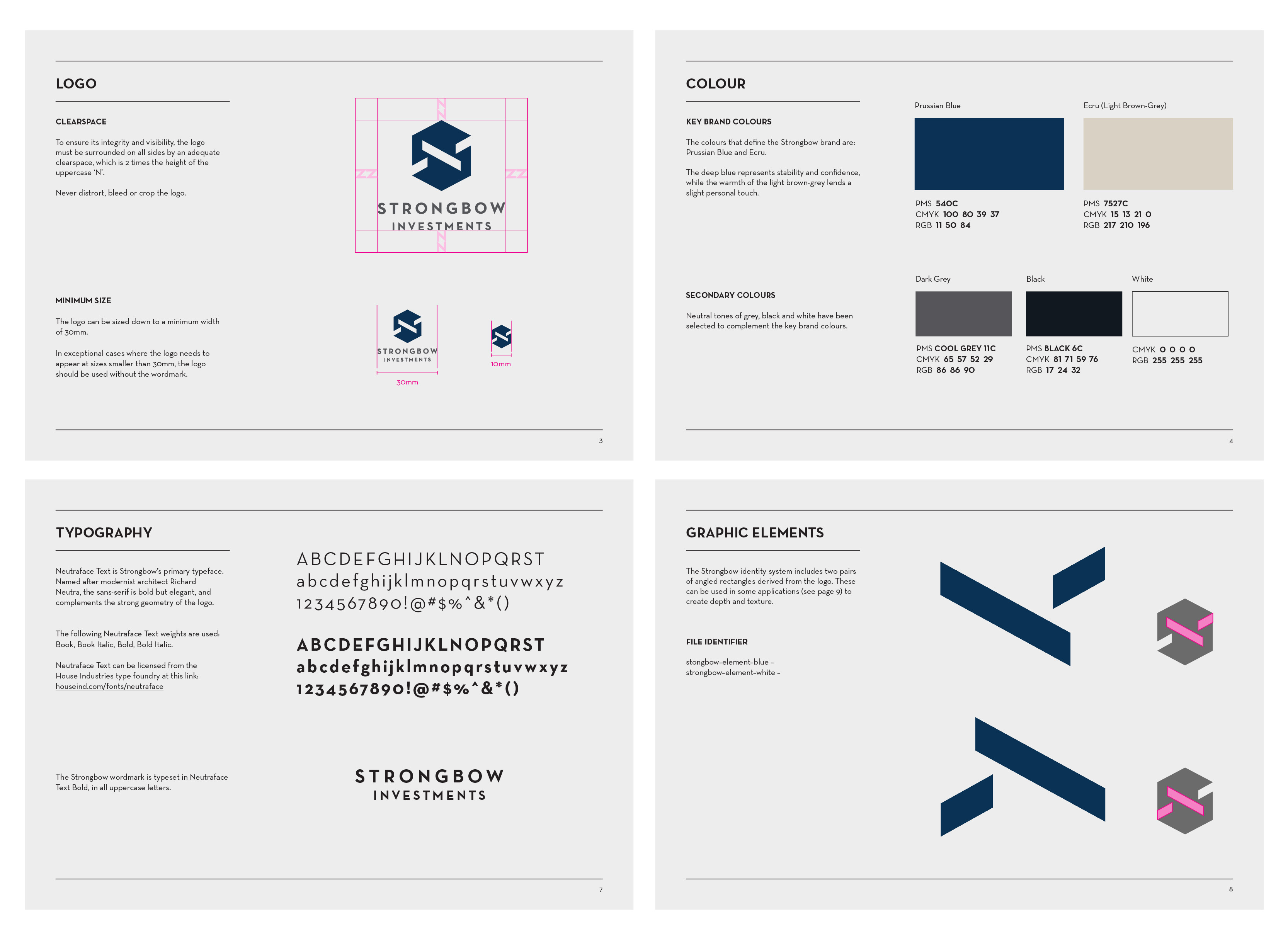
Its new logo is constructed with the letter 'S' contained in a geometric cube, representing the security and reliability of its investments.
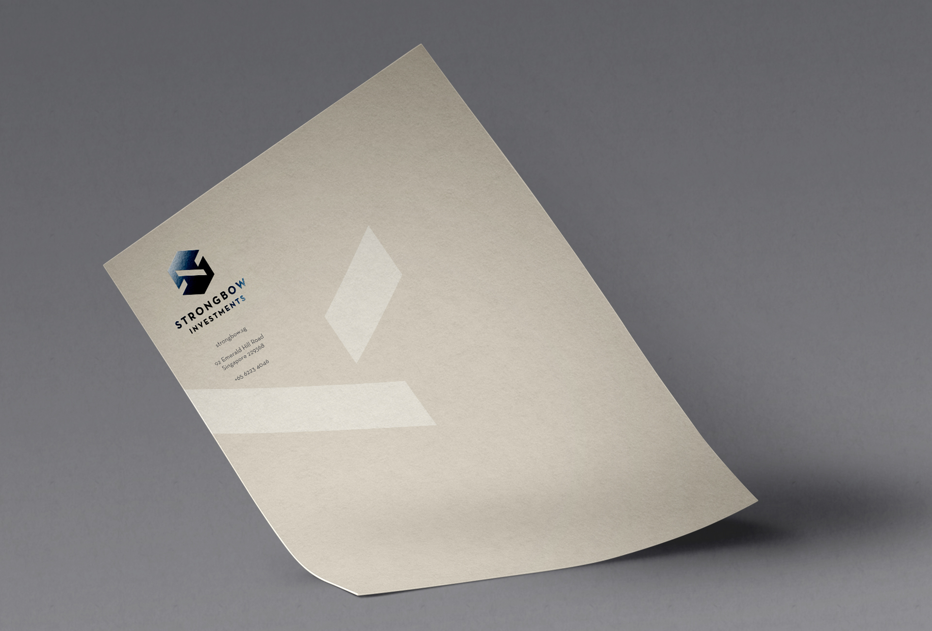
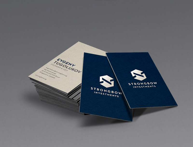
An identity system was developed and applied to name cards, letterheads and presentation documents. The overall approach was simple and austere, bold but elegant – to connote strength and confidence.